The New PULT WebApp: What's Changed
Last updated: October 8, 2026
We've redesigned the PULT WebApp to make booking your workplace, finding your colleagues, and planning your office days faster and more intuitive. This article walks you through everything that's new.
My Workplace / Desk Booking
This is your home base in PULT, where you book your desk and see who else is in the office.
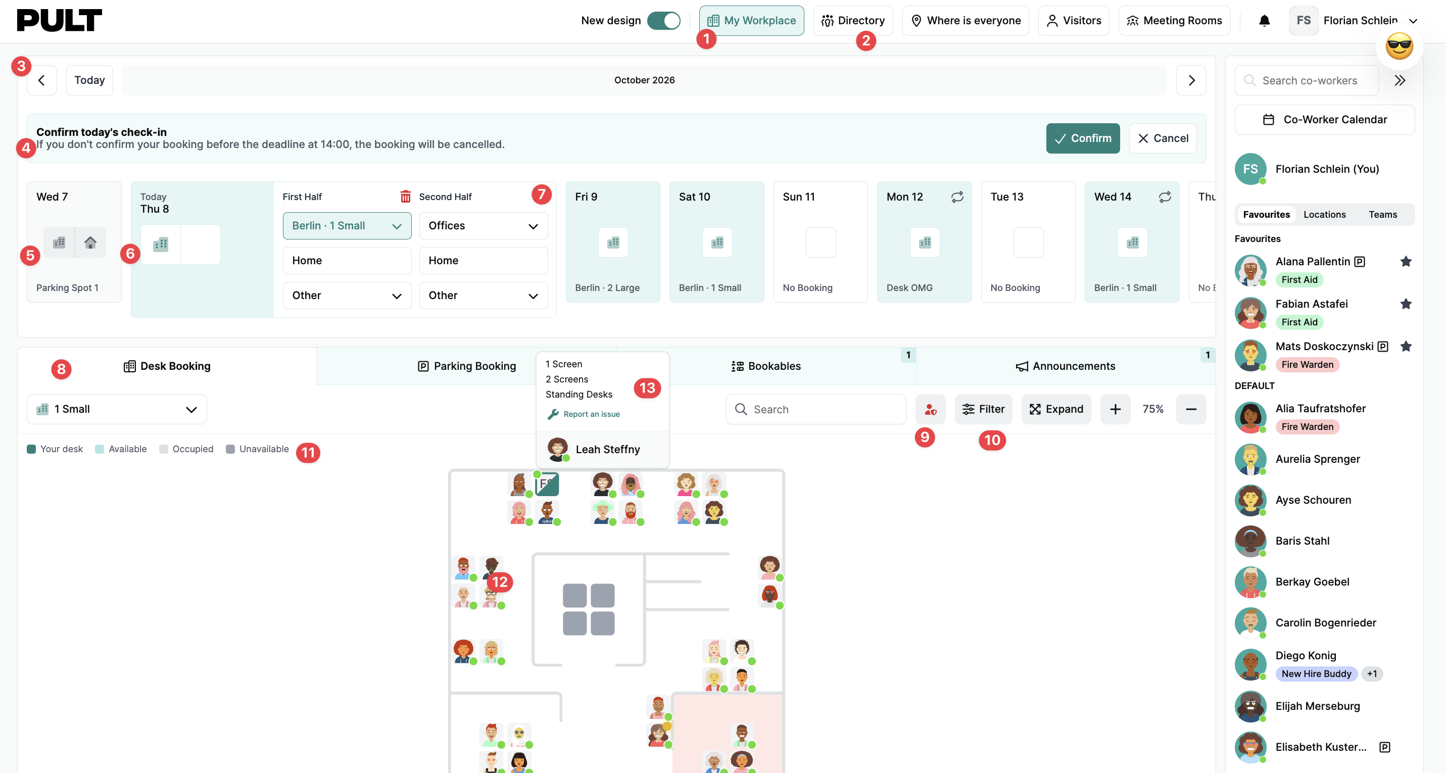
Top navigation: "My Workplace," links to the familiar page where you book desks and see your coworkers. It also includes a new page called the Directory, which is explained in another article.
Directory: Takes you to an overview of your coworkers. More on this further down in the article.
Calendar navigation: Controls for moving through the calendar.
Check-in confirmation: Where you confirm your check-in for that day.
Past bookings state: How days with past bookings are displayed.
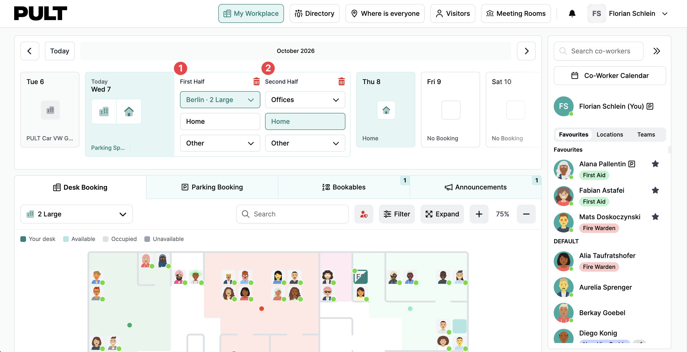
Expanded selected day: A selected day expands so you can make a booking. It also shows everything booked for that day, such as parking, the specific desk, lunch, or another bookable.
Add half-day booking: A button that expands to let you add a half-day booking.
Floor plan and tabs: Lets you pick the location and the floor within it, and includes search.
Emergency helper toggle (new feature): Switches the floor plan to an emergency helper view that highlights who the emergency helpers are, with its own visual state.
Filter: Works the same as it does now, filtering desks by amenities and features.
Desk legend: Explains the desk colours. Your own desk is darker green, available desks are lighter green, occupied desks are grey, and unavailable (blocked) desks are darker grey.
Booking status indicators: Show whether someone is checked in. Someone who has booked but isn't checked in has a greyed-out profile picture and a yellow presence dot. Someone who is checked in has a full-colour picture and a green dot.
Desk hover state: Hovering over a desk shows who booked it, their team, and their presence status.
Coworker Navigation
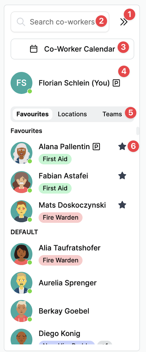
Collapse/expand button: Collapses or expands the coworker panel.
Search bar: Search for a colleague or a team.
Coworker calendar: Opens the coworker calendar, which is explained in the next section.
"You" section: Shows what you've booked, such as parking or bringing a dog. It also shows your employee badges, such as fire warden or key holder.
List filtering: Filters the coworker list by favourites, location, or teams. This is the same as in the current app and design.
Others' bookings: Shows what other people have booked. A star marks favourites, and three dots appear when someone has booked more than two things - hovering on the dots opens a pop-up listing everything they booked. When only one or two things are booked, their icons appear directly, each with a tooltip on hover.
More users: The list shows only the most relevant people and is scrollable. Selecting "More users" opens the Directory, which has all employees with their teams, badges, and other details.
Coworker Calendar
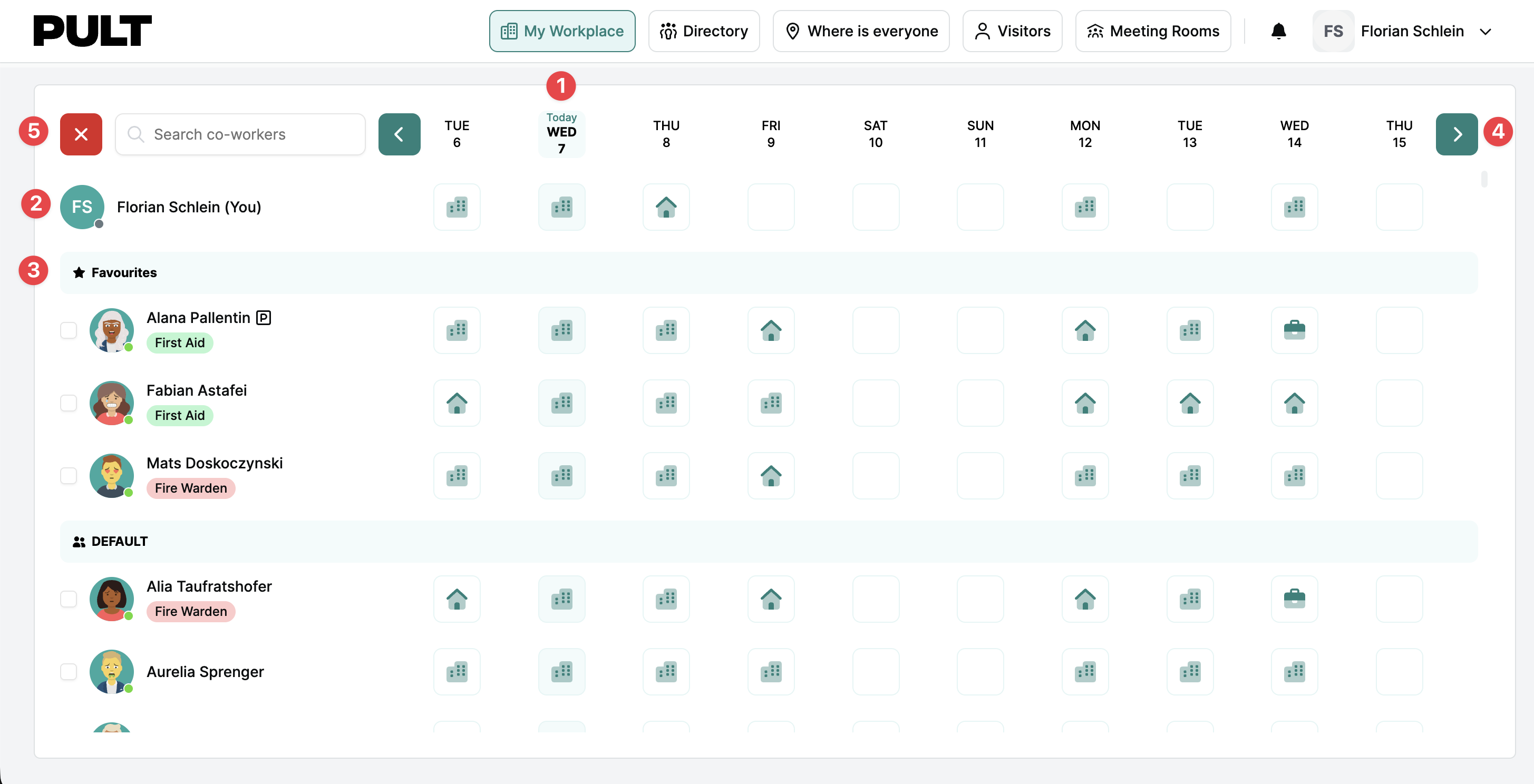
Selected day: The currently selected day is highlighted across its whole row.
Your bookings: Shows your own bookings for the days visible in the calendar.
Segmented list: Coworkers are grouped according to the filter chosen in the coworker navigation, so that choice carries over into the calendar. Filtering by favourites shows favourites first, then your team, then everyone else. Filtering by location or teams sorts the list by location or team instead.
Calendar navigation: Controls for moving forwards or backwards in the calendar.
Exit button: The red exit button closes the coworker calendar.
Directory Page
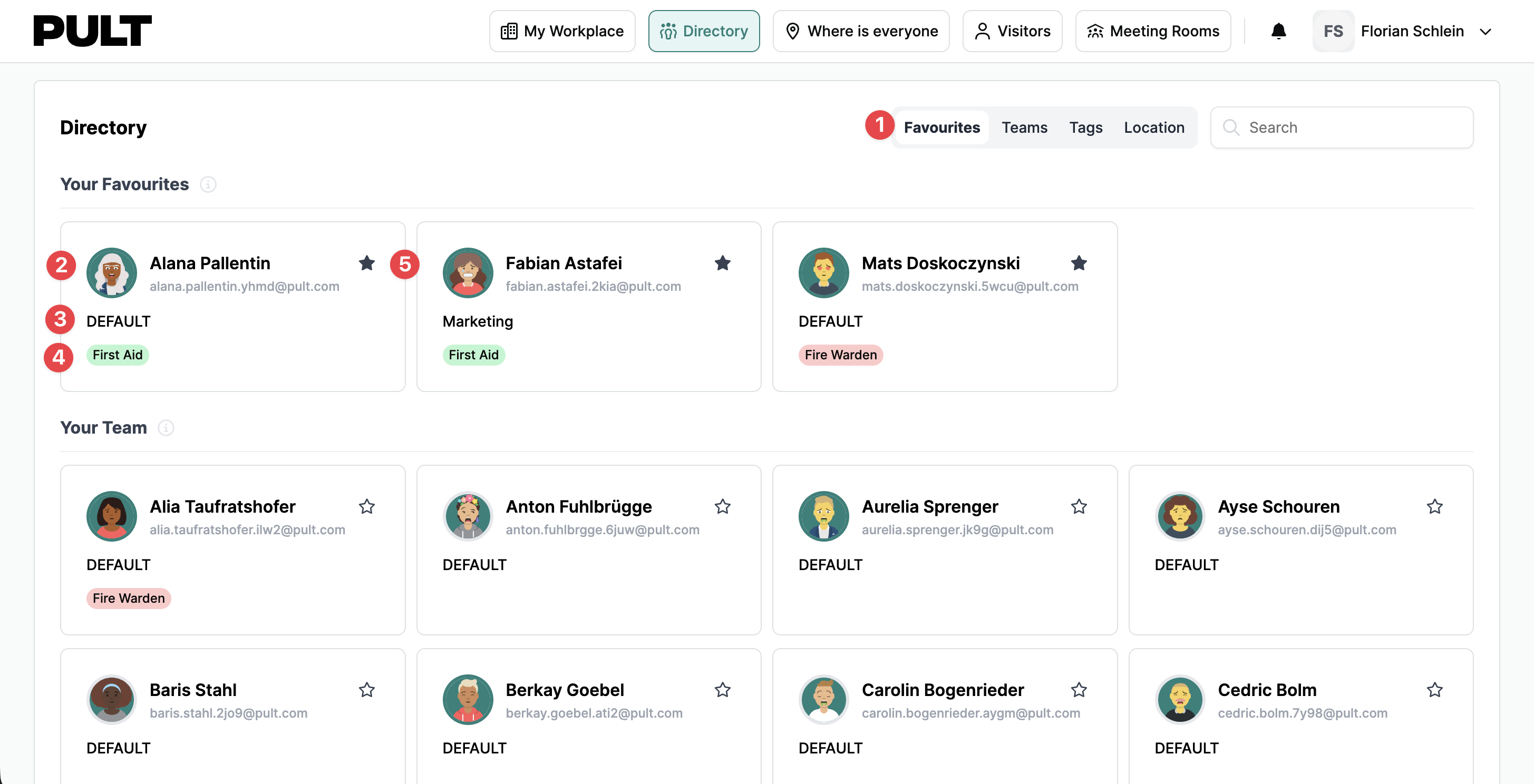
Filter and search: Filters the directory by favourites, teams, tags, or locations so you can easily find who or what you're looking for. There's also a search bar for finding something specific.
Person details: Each entry shows the person's profile picture, name, surname, and email.
Team: Shows which team the person belongs to.
Badges/tags: Shows the badges or tags associated with the person, such as fire warden or key holder. Filtering by tags in point 1 also picks these up.
Favourite toggle: Lets you favourite or unfavourite people directly from the directory.
For Admins: Rolling Out the New Design to Your Team
By default, the new design is only visible to admins. As an admin, you can decide how to set it up for the rest of the organisation.
You'll find the setting in the dashboard under "Settings" → "Styling Settings" → "New Web App Design".
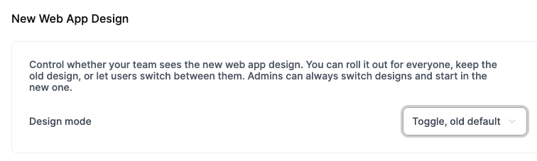
There you can choose which design your team should see:
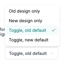
Option | What it does |
|---|---|
Toggle, old default | Shows the old design, but users can switch to the new one themselves via a toggle |
Toggle, new default | Shows the new design, but users can switch back to the old one via a toggle |
Old design only | Keeps the old design enabled, with no option to switch |
New design only | Enables the new design, with no option to switch back |
Questions?
If anything is unclear or you'd like a walkthrough of the new design, just reach out to us at support@pult.com — we're happy to help.